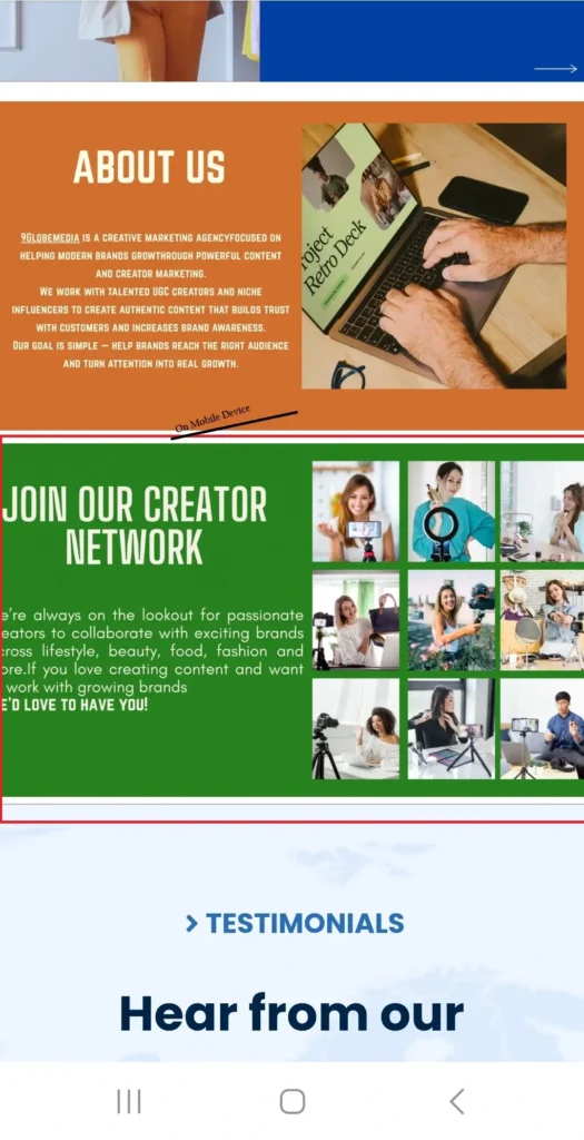
The WordPress Cover block gives you an easy way to build striking, full-width layouts with text overlaid on images or videos. However, when you view these beautiful layouts on a smartphone, you often run into a frustrating issue. The background image gets aggressively chopped off, hiding important visual details and ruining the layout.
This happens because of how the CSS background-size: cover property behaves natively. While it ensures your image stretches to fill the container without leaving space, it does so by sacrificing the edges of your image on narrower screens. When users visit your site on mobile and see poorly cropped images, it immediately impacts the user experience. A cropped image looks unprofessional, interrupts the visual flow, and can make overlaid text hard to read.
Fortunately, you do not have to settle for bad mobile layouts. We can fix this behavior using a clever aspect ratio padding trick and CSS media queries.
Understanding the Mobile Cropping Problem
The background-size: cover rule became a web standard back in 2012. Developers loved it because it allowed background images to fill responsive containers dynamically. The image scales up or down to cover the entire background area while keeping its original proportions.
The downside becomes obvious on mobile devices. A mobile screen has a portrait orientation, while most background images are landscape. To make a wide image cover a tall, narrow container, the browser must zoom in drastically. This forces the sides of your image out of the visible area.
If your image features a person, a product, or a specific focal point, mobile cropping might remove that subject entirely. We need a way to force the container to respect the image’s natural aspect ratio on smaller screens.
Step-by-Step Tutorial to Prevent Mobile Cropping
You can stop this unwanted cropping by applying a specific CSS workaround. This method uses the padding-top property to force the container to maintain the aspect ratio of your background image.
Follow these exact steps to implement the fix on your WordPress site.
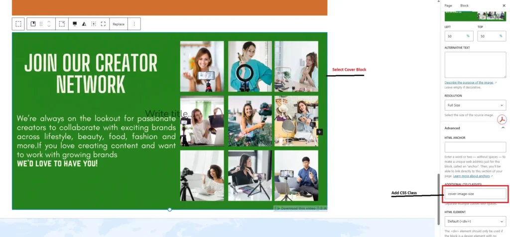
Step 1: Assign a Custom CSS Class
First, you need to target the specific Cover block that is causing issues.
- Open your WordPress page or post editor.
- Select the Cover block you want to fix.
- Look at the block settings panel on the right side of the screen.
- Expand the Advanced section.
- In the Additional CSS class(es) field, type cover-image-size.
Step 2: Add the Custom CSS Code
Next, you need to add the styling rules that will resize the container and adjust the image fitting. You can add this code to your theme’s Customizer (Appearance > Customize > Additional CSS) or your child theme’s stylesheet.
Copy and paste the following code snippet:
.cover-image-size {
    /* Remove the default height set by the Gutenberg cover block */
    min-height: 0 !important;
    height: auto;
}
/* Maintain the aspect ratio of the background image */
.cover-image-size::before {
    content: "";
    display: block;
    padding-top: 56.25%; /* Adjust this value based on your image's aspect ratio (e.g., 16:9 -> 56.25%) */
}
/* Mobile devices (portrait and landscape) */
@media only screen and (max-width: 767px) {
    .cover-image-size img.wp-block-cover__image-background {
        object-fit: cover !important;
        object-position: center !important;
        width: 100% !important;
        height: 100% !important;
        position: absolute;
    }
    .cover-image-size .wp-block-cover__inner-container {
        /* Center align the content */
        text-align: center;
        /* Position the inner container on top of the background image */
        position: absolute;
        top: 0;
        left: 0;
        width: 100%;
        height: 100%;
        display: flex;
        align-items: center;
        justify-content: center;
    }
}
Step 3: Calculate Your Aspect Ratio
The code above includes a padding-top: 56.25% declaration. This specific percentage works perfectly for images with a 16:9 aspect ratio. The ::before pseudo-element forces the container to scale proportionally based on width.
If your image uses a different size, you must calculate the correct percentage. Divide the image’s height by its width, then multiply by 100.
- For a 4:3 image: (3 / 4) * 100 = 75%
- For a 1:1 square image: (1 / 1) * 100 = 100%
Change the padding-top value in your CSS to match your specific image dimensions. If you have multiple Cover blocks with entirely different aspect ratios, you will need to create unique CSS classes (like cover-image-size-square) for each variation.
Key Considerations: Why Choose This Method?
You might wonder why you should write custom CSS instead of just hiding the Cover block on mobile and showing a standard Image block instead. While block switching is a common tactic, it bloats your website’s code.
Loading two separate blocks for different devices forces the browser to download unnecessary HTML. It makes your page heavier and harder to maintain. If you ever want to change the text or update the image, you have to do it twice.
By utilizing CSS media queries and the padding-top aspect ratio trick, you keep your page lightweight. You serve the same HTML elements to every user, letting the browser’s rendering engine handle the layout adjustments efficiently. This CSS method preserves your content hierarchy and keeps your editor clean.
Final Thoughts
The WordPress Gutenberg Cover block is a fantastic tool for creating rich visual layouts, provided you manage how it scales on smaller screens. By applying a custom CSS class and leveraging CSS media queries alongside a calculated aspect ratio padding trick, you take full control of your background images. This guarantees your important visual elements remain front and center, no matter what device your visitors use.
Take a few minutes to apply this code to your own website. Once you add the snippet, shrink your browser window or pull the page up on your smartphone to test the layout across multiple device sizes.


")
